I am reaching out to the community for potential advice or solutions regarding an inefficiency in our current workflow.
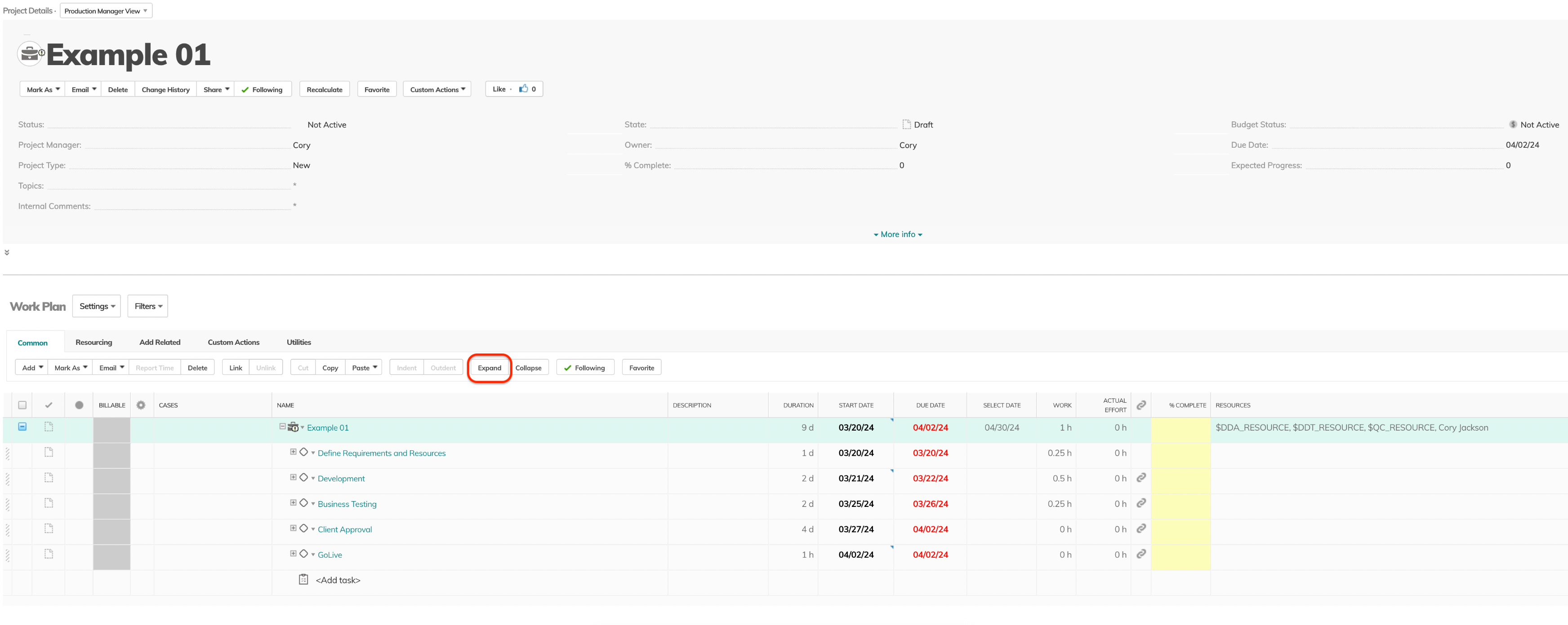
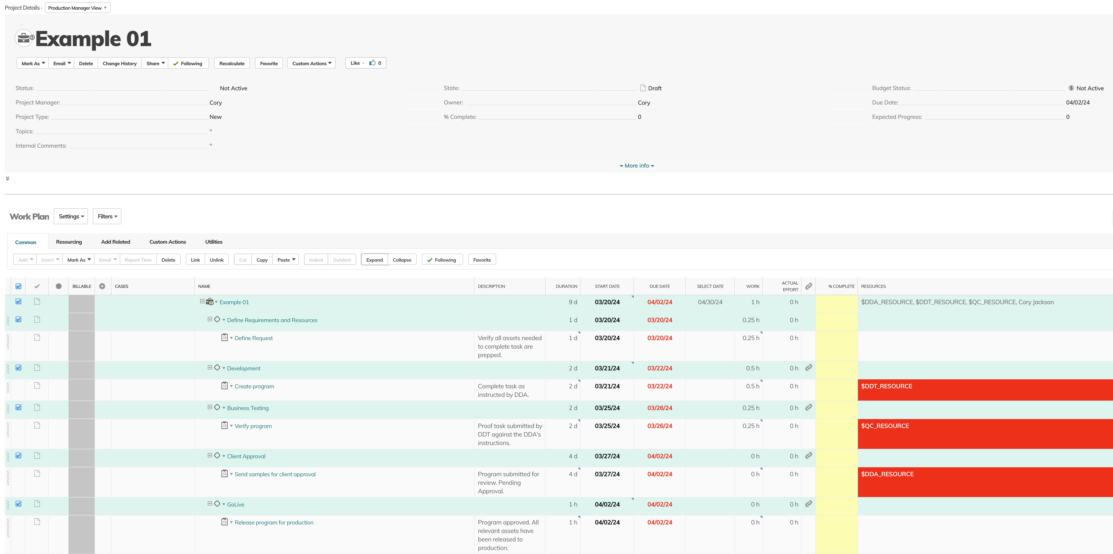
My team frequently interacts with Project views and, as it stands, we find ourselves continuously performing the repetitive action of expanding our Project view to see all tasks associated with a project.


Currently, the system defaults to a "Collapsed" Project View, and while this default setting maintains a clean interface, it introduces a time-consuming step that we must repeat with each project interaction. This process results in an accumulation of redundant clicks over time, representing a non-trivial impact on our productivity.
In a previous engagement with support last October, it was noted that a default "Expanded" Project View setting was not feasible.


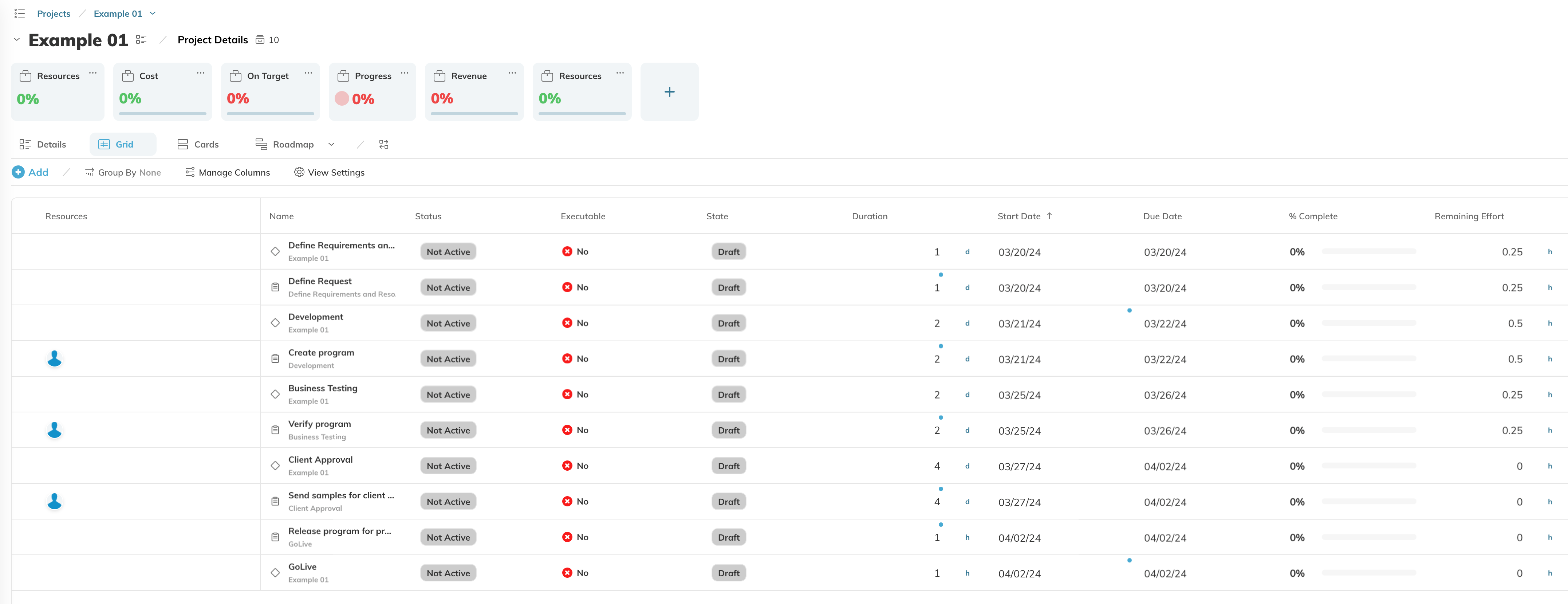
However, it appears that a Default "Expanded" view is exactly what the Hybrid Grid view is offering today. Regrettably, the Hybrid interface lacks the 'replace resources' feature, which is critical to our workflow when using the classic view.
Consequently, even though the Hybrid Grid view expands by default, the absence of this key feature makes it an unsuitable alternative for our project management processes.
Is there a workaround or a potential modification that anyone has successfully implemented to enable a default "Expanded" Project View?
Any insights or shared experiences in this regard would be greatly appreciated.


