Flow metrics tell you what is happening in your delivery pipeline, but they rarely reveal the why. What if you could dig deeper and uncover the root causes behind those numbers?
The key lies in transforming raw data into actionable insights through intelligent visualization. By leveraging AI-powered analysis tools and Python, you can move beyond surface-level metrics to understand the underlying patterns that drive your team's performance.
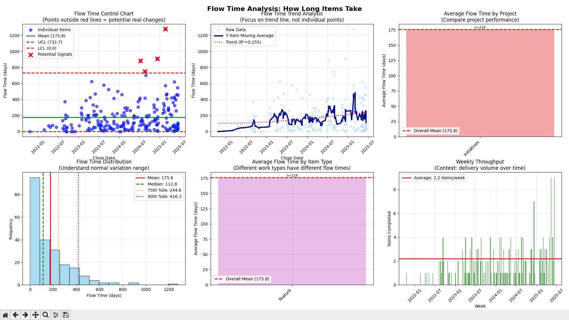
From Data to Discovery in Minutes
Take the Viz Flow Item Analyzer (FIA) CSV export, for example. Combined with Python's visualization capabilities, this data becomes a powerful lens for examining your delivery process. Scatterplots of flow time data are particularly revealing—they expose individual bottlenecks and outliers that aggregate metrics often mask.
When you can see these friction points clearly, you can begin to categorize and systematically address them. As the saying goes: "You can't manage what you can't measure"—but more importantly, you can't improve what you can't understand.
Using AI assistance (like Copilot), I recently generated comprehensive flow analysis visualizations in just 15 minutes. The insights were immediate and actionable, highlighting specific areas where our team could optimize delivery speed.
Join the Conversation
I'm curious about your approach to flow data analysis. What visualization techniques have you found most effective for uncovering performance insights? Are you using similar AI-powered tools to accelerate your analysis workflow?
Let's share our experiences and elevate how we all approach flow metrics analysis.